


Evaluations of PostSecret and
PostSecret: I’m not sure whether to say PostSecret does or doesn’t make the user think. If you were to arrive at postsecret.com with no prior knowledge of the site, I admit, you’d probably be pretty confused, and you’d be asking a lot of questions, so I guess in that way it’s poorly designed (as much as I hate to say it). On the other hand, PostSecret involves essentially no site navigation – you type in the URL, and once you’re at the website, there’s nowhere to go but the homepage. So, it’s easy to navigate, but also leaves a lot of questions unanswered. PostSecret does not require (or even offer) accounts, and I personally think that the very simplistic set-up of the website both directs the user’s attention in the proper direction and achieves feature exposure, since really the only thing to look at is the postcards themselves. Frank (PostSecret’s founder) has absolutely set up this website to be simplistic – I think the simplicity of it is what drives the entire appeal of the website, and he’s certainly not afraid of the extra space. He does include some side-bar links, including a Facebook widget, the address for sending in postcards, and upcoming events, but for the most part, the website has the secrets, and just the secrets. As I reach “visible language” I’m slowly running out of ways to say that the simple design of postsecret.com is basically perfect if you ask me, and visiting the site it’s plain to see that while you have to read the postcards, they are very focused on imagery as well.
A screenshot demonstrating how PostSecret directs a user’s attention and isn’t afraid of empty space.
http://www.postsecret.com – I think it’s important to note that the purpose of this website is very different than the types of websites Krugg was focusing on in his article, and therefore the design is different as well.
The Valley of the Shadow: The first thing I noticed when I opened this website is that they have an opening page where you have to click a button to actually enter the website, and I think that right there they probably lost some potential visitors by adding that level of complexity. Based on Krugg’s criteria, having to click on an extra button is probably making the user think too much. Once I entered the actual website, there are links to three different time periods via strange pictures that look kind of like blueprints for a building, with each section labeled. What I didn’t initially realize was that it actually matters which section you click on. I understand what they’re getting at, but I think that this also is too much thinking for the typical users. I have to admit, they don’t really have my attention because the site is kind of plain and boring, and a little difficult to navigate, but this site, like PostSecret, isn’t afraid of white space. This website could definitely be easier to use by changing the navigation system and ditching the strange blue-print pictures.
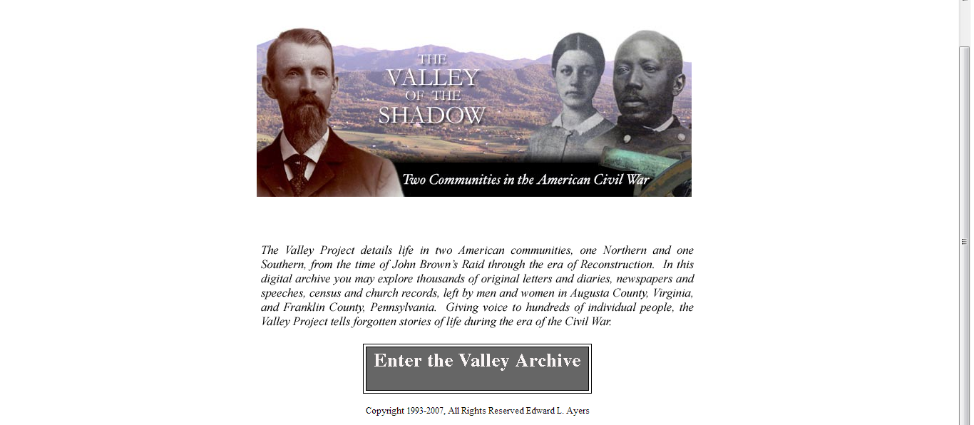
Valley of the Shadow opening page.
Leave a reply